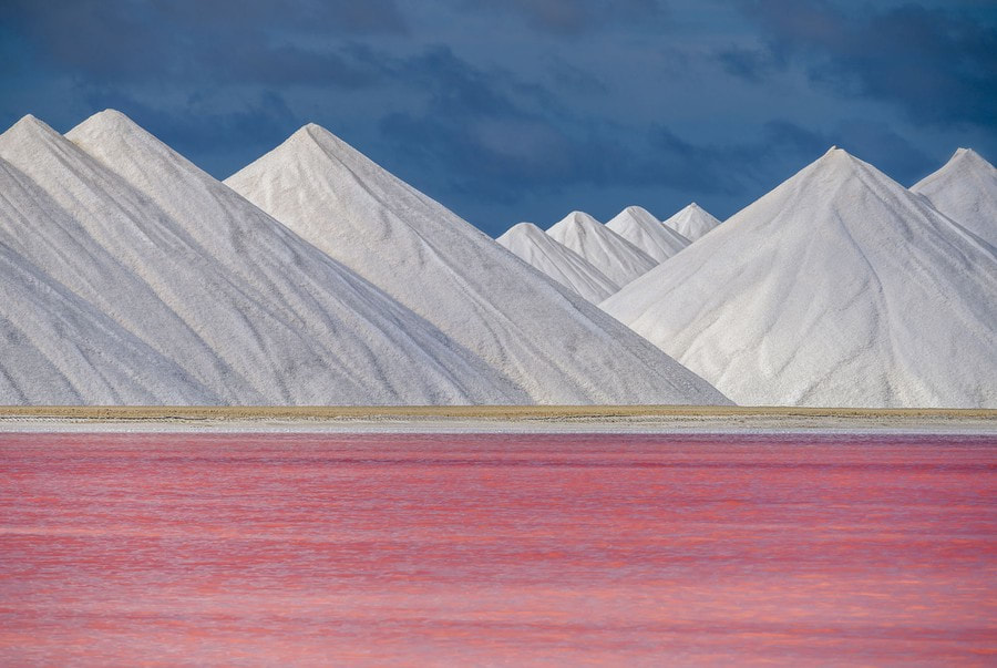
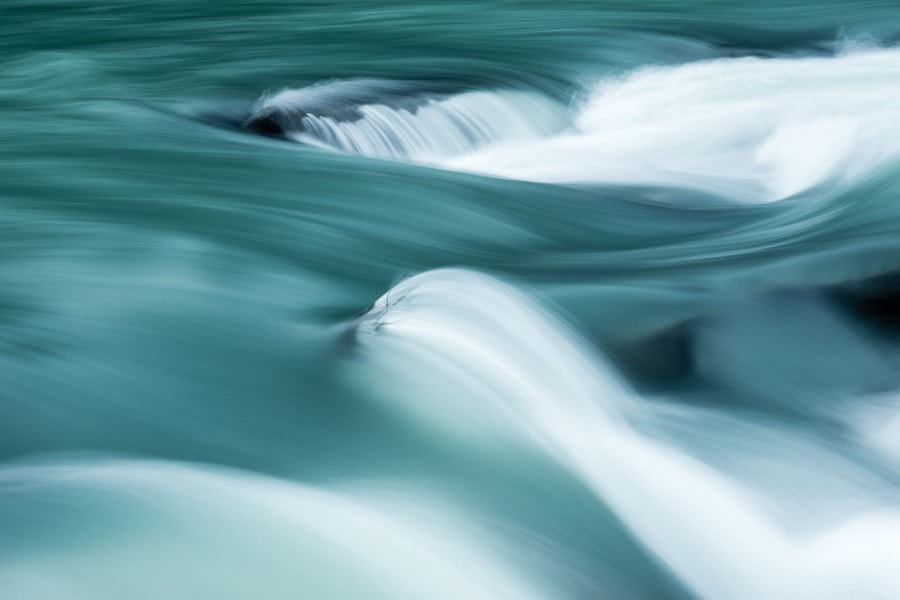
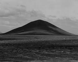
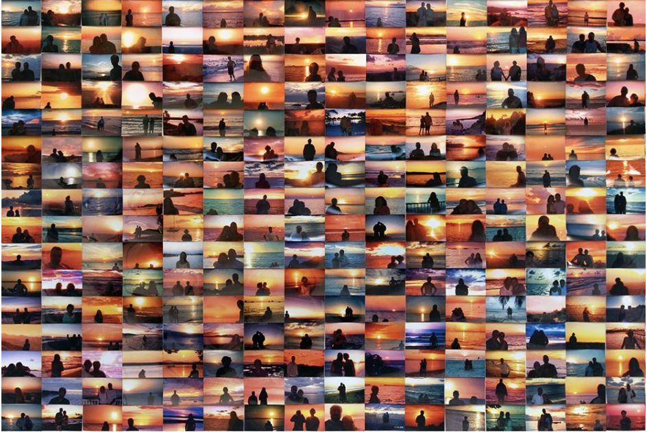
When i think of landscapes i think of mountains and different nature setting as well as city sky lines and location images . A landscape is the visible features of an area of land , some examples of landscapes are mountains ,sunsets ,nature ,sky lines ,trees ,country sides, tropical views, locations ,forrest ,wide lens view ,lots of light ,extreme weather and seas/rivers/lakes . When i did a google image search for landscape i found images that followed the caliber of words listed above , i also found less intense images that were made up of more green landscapes and blue skies , below are some of the images i found .
|
|

Although i wouldn't necessarily be draw to creating and photographing landscape images the process of taking the photo and experimenting with different aperture and lenses interested me and was something i wanted to try .
When researching landscape i cam across of video called the policies of landscape art and i came across the phrase "land is always political" ......."sculpted by the hands of history" and it made me think about the soft privatising of public land , an example of this could be Regents Park ,picking flowers in Regents park is not allowed as the queen "owns" the park as it is one of the royal parks so if you pick the flowers you are picking the queens flowers , this also made me think about the idea of owning land and the ideology behind that and why people do buy land , some people buy land in order to work the land in the agriculture industry and some people by land to build a house and own that land as property and some people buy land purely because they want to and they can afford to . the phrase "sculpted by the hands of history " made me think about the history behind these behaviours and the impact that it still has on the public today , i then wanted to think about how i could reflect the privatisation of land and nature in my own work.
To further understand the depth of the topic of landscapes I research different landscapes photographers and their work below are some that I found .
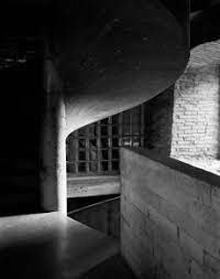
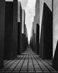
Helen Binet
Helen Binet is a swiss french architectual photographer based in London , she studied photography at the istituto Europeo Di Design in Rome , She worked as a Photographer at the Grand Theatre de Geneve , a famous opera house in Geneva ,were she photographed different performances until turning to architectural photography , she is one of the leading architectual photographers in the world , she is most known for her work with Architects Daniel Libeskind ,Peter Zumthor and Zaha Hadid , and has also published books on works of several architects. Binet works exclusively with film and her work has been shown in solo exhibitions as well as the most important exhibitions around the world .
|
|
|
Whilst creating my response to Helen Binet I wanted to make my photos as similar to hers as possible and decided to photograph my landscapes in black and white to replicate the authenticity Binet has created . I decided to photograph local landscapes and see how m work personal could improve by responding to hers .


W.W.W: I really liked how these photos turned out and was happy with the overall product
E.B.I : I wish I could of taken more images outside and in a variety of different locations that didn't have as many distractions like people in the image
E.B.I : I wish I could of taken more images outside and in a variety of different locations that didn't have as many distractions like people in the image
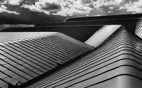
Guy Tillim
Guy Tillim is a South African Photographer known for the work he did that focused on troubled regions of Sub-Saharan Africa , during most of his time as a Photographer he worked freelance for both local and foreign media companies , including Reuturs and Agency France Press
|
|
|
I liked how these images had a slightly haunting side and makes the person viewing the photo wonder the story behind it . they have ornate nature that catches the eye.
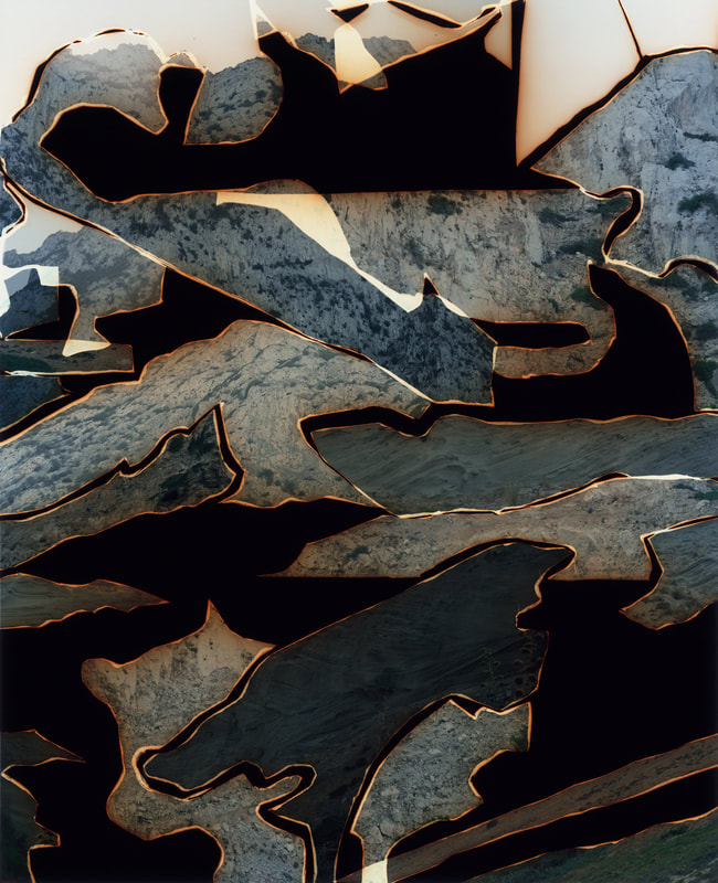
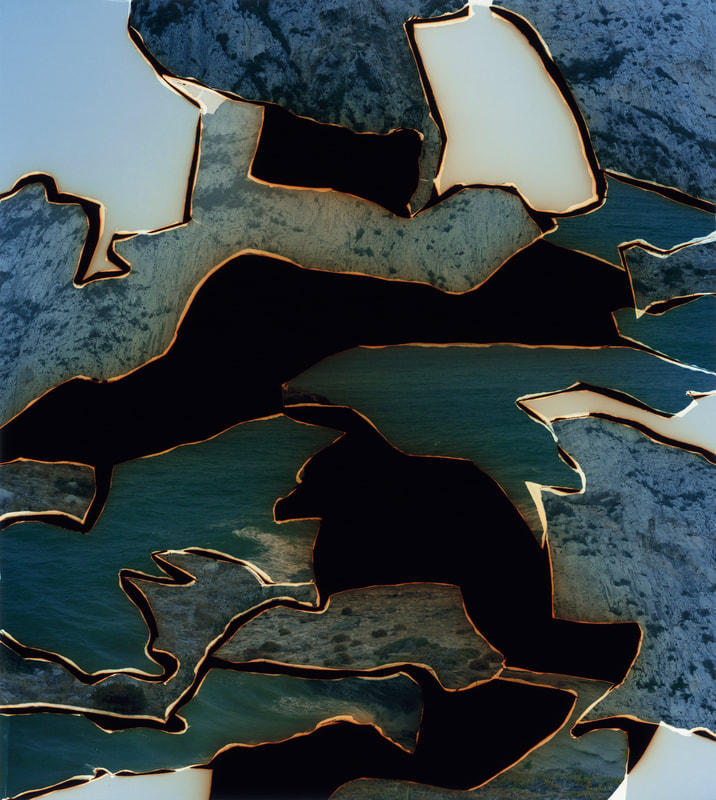
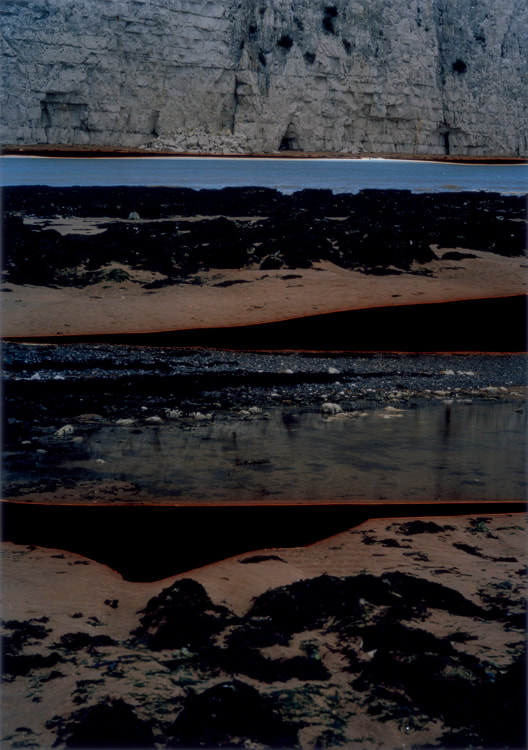
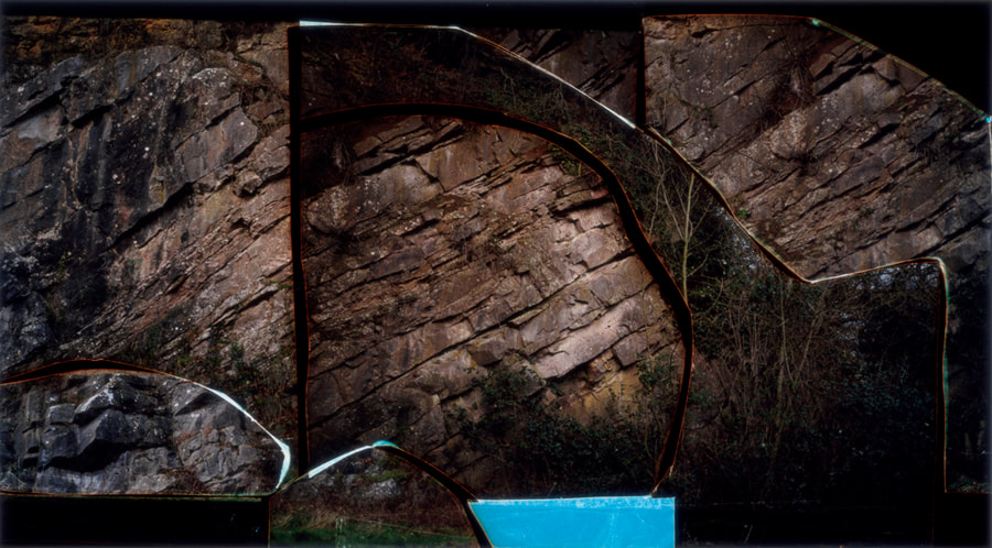
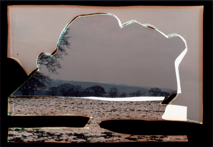
Dafna Talmor

|
I chose this image because I was interested in the use of reflection and the use of the individual images to create a single photo . when I first looked at the photo I was unsure of whether or not this was a image composed on a beachfront using scrap metal and reflective surfaces or weather or not it had been constructed using a number of different images , regardless the overall images gives of a electric and choppy atmosphere and it almost feels as if different images have been set a light and placed next to each other to burn . I think the photographers aim in this image was to create a landscape photo using different types of landscapes , if you look closely you can see a beach front and something resembling the base of a snow covered mountain , this interested me because these two opposite landscapes have been merged together to create one final image and I wanted to know if this was something the photographer specialised in or if it was just a one of project .
|
|
|
|
|
|
from researching different artist I found a greater appreciation for landscape photography , initially I just just thought of mountains and sunsets but nor I understand that there is a artistry behind it all , the beauty of landscapes can be taken into the hand of a photographer and manipulated to become anything yet still preserve the beauty of nature . As I came to the end of my research I had more clarity over the work that I wanted to create .
This project is called constructed landscapes and will be part of my final component 1 composition . As I start this project I knew I wanted to experiment with creating different form and genres of photography and really push myself out of my comfort zone. I was also really interested in using the dark room and transferring images onto the special paper and experimenting with how different materials affect the image as an object . from previous artist research I knew I was interested dafna talmor and the work that they produced . In my own work I wanted to show that I had been influenced by this style but i was not copying it , in this project I want to create work influenced by photographers but work that is still my own authentic self .
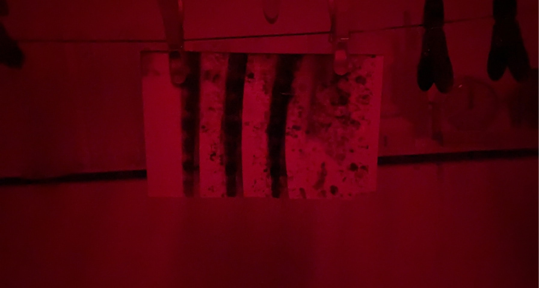
Black and white landscapes - School landscapes


W.W.W: I was happy with the images I took today ass I feel that I successfully experimented with different lights and what happy with the black and whit images
E.B.I: I think I could have taken more photos with the red light as I really liked the effect it had on the image .
E.B.I: I think I could have taken more photos with the red light as I really liked the effect it had on the image .
Landscapes out of school :


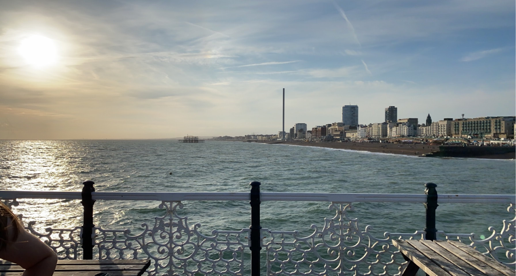
I really like these landscapes , they are a bit basic but I really like how they turned out , I took two of the images in Northern Ireland and the remaining two in Brighton , I like the seascapes and the loch but I would like to experiment with different landscape photography now .
|
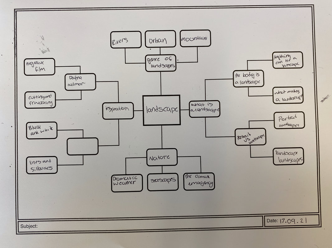
from experimenting with different genres and styles of photography and creating a mind map so that I could clarify my ideas I know that I want to create images using everyday urban landscapes as well as some seascapes to create work inspired by Dafna talmor , I really like the effect the photo has and how the edges almost look like they are on fire in the image . I already have some images that I have taken that I plan to use but I would like to use film and negatives as well as found images and acetate paper for my final piece . POPPLET
|
To start my project I created a mood board of artists I was inspired by and photos I was interested in , this helped me to clarify my ideas and set out a clear path of what I wanted to create .
More Landscapes Images


Awoiska Van Der Molen
Awoskia Van Der Molen was born in 1972 , she is a dutch visual artist and says she uses photography as her main tool . Her black and white images are abstract representations of anonymous landscapes , these images are a product of her wish to return to the place in which she produced the image , the uncorrupted territory of nature . Van Der Molen is a accomplished artist and has been shortlisted for the prix pitchet which is a global award for photography and sustainability. Her next exhibition is called "Hope" and is touring worldwide in 2021 . Van Der Molen has been shortlisted and won many awards some of which include the Larry Sultan Photography Award 2017 , The Japanese Hariban Award in 2014 and was also a finalist for the Hyeres Festival International de mode et de Photographie in France .


I really like Awoiska Van Der Molens work , I really like how to reflects and creates a solemn atmosphere . I feel like the images are very cold and sombre but also personal and delicate. It makes you appreciate the images . Some of my favourite of her images are pictured below .


Luke Saxon
Luke Saxon is a photographer based in rochdale , he primarily takes photos exploring small towns and finding humor in the images he creates , he has a degree in photography from the University of Central lanachashire , his work has travelled across Englands seaside town including the likes of Touchstones Rochdale , The Whitworth in Manchester ,The Finishing Quarter in Brighton, The Photographers Gallery London and manchester contemporary . Below is an example of some of Saxons work .


Although I appreciated Awoiska Van Der Molen nd her work I enjoy looking at Luke Saxons work more and I fell that it inspires me to create and want to find my own style with the same comical twist his work has however I like that Van Der Molens work has a feel of solitude and that that is a consistent theme throughout all her work . Something I really like about Saxons work is that the sense of home he tries to create ireally comes across , when I look at the images I can tell they are personal to him , Van Der Molens photos feel more intimate than they do Homely and I think this could be due to the midst both artists have towards the work they create.
|
|
For Example the photo to the left (Saxon) upon first look fells like it was taken by chance , In this case the photo to the right (Van Der Molen) feels more composed , this is not a bad thing as personally I like elements of both photographers and their style and the illusion the image creates , it interests me as to how the different processes of photography affect the end result of the image .
|
Collaborative Collage
In response to both Luke Saxon and Awoiska Van Der Molen we created a collaborative collage using photos we had taken as well as the work of other students . We selected the images we would like to use and printed them in varying different sizes so that we could experiment with how size affects the appearance of our collage . whilst doing this I also tried to focus on creating continuous shapes and lines within the piece so that the collage did not look like 4 photos stuck up next to each other but one complete piece . below is the progression of my collage .


I was really happy with how my collage came out as I liked that I had experimented with the rotation of the image and also different colour palettes . I would off liked to off had more images to work with as I did struggle to find photos that followed the shapes in the image that I was trying to extend . but overall I really liked the work I created , I really liked the crossover parts of the image as I felt it brought together the collage and the shapes transferred nicely .


These were the meeting points of the images that created the collage , my favourite is the one in the middle because is looks like the landscape has been reflected back on itself .
Distorted Images


W.W.: I was happy with these images there not my favourite but I thought the met the brief we were given , to take distorted images of the school
E.B.I: Although I liked the images I felt like they could have been improved , maybe I could of experimented with different forms of distortion not just the film over the camera .
E.B.I: Although I liked the images I felt like they could have been improved , maybe I could of experimented with different forms of distortion not just the film over the camera .
Landscpaes outside of school continued .


Making day
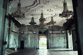
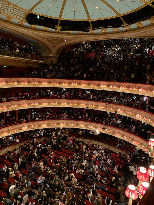
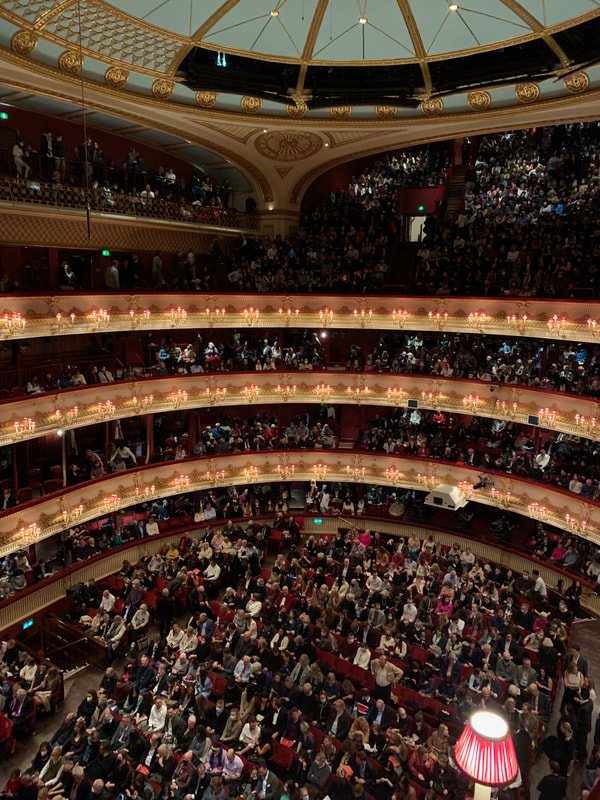
I started out with two images I took at The Royal Opera House in Covent Garden , I took the first image before the performance had started and I took the second as the audience were leaving , at first in my project I though I wanted to create a single image showing the audience seated before and leaving after the show was over. I planned to do this by printing an acetate of the second image and laying it over the original coloured copy of the first image to show the contrast between the beginning and the end .
|
|
I found that the acetate was very dark and was not contrasting with the coloured image in the way I had hoped so I used a Lightbox which helped to see both the audience sat and leaving .


Despite the lightbox I found that the image was still very dark but I liked how the gold of the balconies became prominent in the photo and I decided to experiment using the gold banners a bit further ( see 4th image above ) . I found that this was unsuccessful due to the darkness of the acetate and I decided to do some artist research to inspire me in my own work .
Klea Mckenna
Klea McKenna is a visual artist who also makes film and writes . Her work has been showed and published internationally and she has had exhibitions in the likes of The V and A in London . In addition to her own work she is also the photographer and co founder for IN THE MAKE online art journal that published studio visits and interviews with over 120 artists in the west coast of America . She now lives in San Francisco with her partner and children . Below is some examples of her work


What interested me the most about Mckenna's work was the constant use of continuous lines and curves , my favourite of her images are the ones pictured above . I liked how all the photos were different shapes and orientations but when put together made one continuous image , it reminded me of a map and this interested me . I though I could use the same opera house images to create a similar outcome . I decided to create negative images in the dark room as I knew from previous projects that this was something I enjoyed creating and experimenting with . When I first went into the dark room I did some tests on scrap bits of photography paper to figure how long I needed to leave the acetate and photography paper under the enlarger and then I proceeded to create more negatives as I continued I tried to use varying shapes and arrangements so there was contrast in my final project . Unfortunately I discovered half way through my printing that my darkened acetate was making it difficult for the finer detail of the image to be transferred onto the paper , but I changed the exposure and that made a difference . Below are all my negative images .


|
Before creating my images I made a series of tests in the dark room , strangely most of my test images turned out better than the real ones but I think this was because the smaller scale meant the enlarger could capture the detail of the acetate more accurately .I was happy with most of these images but was a bit disappointed in how dark some of them came out and how light some of them developed to be . I then began to lay all the images out and arranged them trying to follow the continuous curves and lines
|


As I went on with the project I actual began to really like the lighter images and how they looked but wasn't completely happy with the way the lines fit together when viewing at a distance however I was happy with how they looked close up . I decided to use all my images in a another attempt focusing less on lines to see if it would work better , below are the results .
|
|
I started by connecting the balcony lines of one image to another and so on and decided I wanted to try and recreate the original photo behind the printed images but it didn't work very well due to the the fact I had cut up the image , it still had a white border and it wasn't big enough however I really liked the direction in which this outcome was going so , I decided to continue , just to see how the different images fit together , below are the results .
|


these our my favorite images from this outcome because of the way the lines of the balcony line up and the coolers contrast , these were defiantly my most successful images and I'm actually happy with the outcome .
Sustainable Darkroom workshop
We took part in a Sustainable Photography Workshop led by Alice from the Sustainable Darkroom . She taught us that there are other ways to create negative images that do not have a negative effect on the environment . The chemicals used in developing normal negative images relate pollution into the atmosphere and the sustainable darkroom offer alternative ways to make these chemicals . We used Rosemary , Vitamin C , Leaves , water and soda crystals to create our developer . These are all household items which is important as it gives a wider variety of people access film photography .
|
|
One of the first things we did was go outside and collect plants and leaves , I wanted to have a wide variety of textures so I could see if they would have any interesting effects on the image I produced . We used expired film paper to make our Chemigrams as they have chemicals in them that react with the natural developer.
|


|
|
When making my first test image I chose to use olive oil as the blocker , I painted it onto the photographic paper and I swirled it around with my paintbrush . I thought this would make lots of swirls and interesting patterns and shapes but unfortunately it didn't tun out as planned . When I the put the developer on the image because the olive oil is also liquid it just swirled around and the pattern was lost . Once I had finished making it we had to leave to to rest over a couple of weeks so that the chemicals to settle and become fully exposed to light .
If you look really closely at the final photo of my image you can see the swirls of the paintbrush but I put on too much developer so it became very dark For this experiment I just used a pipet and a paintbrush to drop various different blockers and developers onto the film . This one did not turn out well but it was fun to make .
The rest of my chemigrams had varying results as none of them turned out amazingly . overall I really enjoyed the process and would defiantly think about including more sustainable methods of photography in my own personal project .
|


Experimenting :


Out of the three images the third image is defiantly my favorite and the most successful image , the definition of the lanterns really comes through compared to the first two . The first and second image are both to dark and make it difficult to actually see the image , however I do like the first one as it looks a bit like an elephant .


I was happy with how these turned out and I liked the contrast of having two different monochrome settings and placing something colorful behind it , my favorite was the second one , this was the first image I created an I think it was the most successful as the blue in the background image enhances the trees as it is almost giving life to the black and white image , I also like how its a environmental landscape over a urban landscape as it provides an interesting contrast between the two settings and perspectives .


I used images that I was creating for another project to create a large collage , As i was creating my collage i began to find moments within the collage that i really liked . for example this part of the collage as were the two negatives joined it looked like the audience in the photographed blurred into one and I thought it resembled a reflection , I wasn't happy with the chaos of the collage as many of the themes were repeated and I thought all the focus points were a bit confusing , I wanted to find a way to create I work I was happy with that represents the artist I was inspired by , I thought maybe I needed to re consider my artist inspiration and change the approach I was taking to my work . This was something I wanted to bear in mind as I approached my making day .
Further experimentation
To create these images I held the original photos up agains the camera on the Photo Booth app , because it had multiple boxed images it created a grid effect on the original image . I scree shotted the app and printed the photos out and repeated this process a couple of times until I was happy with the effect it produced . I printed out one of the photos using the X-Ray effect and I cut out features from the original image and constructed my own take on a landscape .


I really liked some of the shapes the painted hall images made ad the colours swirled and mixed really well .

|
This was the best image that I created , I liked how that whichever line you when across it still started and produced the same product of both the cars and the yellow line . I thought the blue background really contrasted and complimented the cars and the yellow line well however it could of been better if I had made more images .
|
Doorways At Night
Having had a consistent streak of unsuccessful experiments I decided to try something new . I was still very inspired by the two artists Penelope Umbrico and Sarah Anne Johnson but I didn't know what to do as my final project so I made a mind map .


To make my mind map I started by listeing the artists I was inspired by , and what I could make if I used them as inspiration . The three artists I listed were Penelope Umbrico , Awoskia Van Der Molen and Sarah Anne Johnson . I have worked in response to all three of these artists before but there was something I really liked about their work and how it communicated to a viewer , each brought to light a new atmospheric feeling or emotion and I thought that was a really good quality , so I decided to use the three of them for my inspiration .
Awoskia Van Der Molen

|
Awoskia Van Der Molen is a dutch visual artist and uses photography as her main creative tool . Her black and white images are abstract representations of anonymous landscapes , these images are a product of her wish to return to the place in which she produced the image . Van Der Molen is an accomplished artist and has been shortlisted for the prix pitchet which is a global award for photography and sustainability. Her next exhibition is called "Hope" and is touring worldwide in 2021 . Van Der Molen has been shortlisted and won many awards some of which include the Larry Sultan Photography Award 2017 , The Japanese Hariban Award in 2014 and was also a finalist for the Hyeres Festival International de mode et de Photographie in France . what i like how isolated he images feel and its something I was really draw to , it possessed a feeling of serenity who h I found calming and also a bit eerie , when I look at my collage I want it to feel the same way , like you can see every detail and the viewers feels calm .
|
Penelope Umbrico
|
Penelope Umbrica is an American Artist best known for appropriating images found of google and other search engines . Her images are an archive to explore consumption and creation of images . Umbrico aims for her work to create a navigating relationship between producer and consumer . Her work has been exhibited and displayed in various gallery's such as The Museum Of Modern Art (NY) , The Photographers Gallery (LDN), Rencontres d'Arles (Fr) and The Gallery Of Modern Art (AUS) . What drew me towards her images was how colourful they were and how each image accounted for different experiences .
I'm going to incorporate Umbrico's style by displaying around 20 of my images in the gridlock style that she did . |
I settled on the idea of doorways at night , although this sounds a bit simple I have a plan to develop the idea so that the final instillation has multiple outcomes . Im going to start by taking 20 photos of doorways at night , I'm then going to place them in the same grid formation as Umbrico . Once I've done this I'm going to expand my project by creating a collage that combines other urban landscapes .


i Found sky scrapers images of google earth and I screenshotted them and cut them out to use in my collage , Once I had created my own skyline across the bottom of the doors collage I reflected it across the top ,what I like about this is the contrast between personal and impersonal landscapes , landscapes such as the shard are available to everyone whereas my road in Charlton is somewhat hidden from the whole public population of London .


Here are some of the reflected images . I like how this has turned out as where the reflected images intertwine with each other and create a interesting use of negative space . Going forward I want to develop my collage further using different photographic techniques including acetone transfers .


When attempting my acetone transfer i used news paper cuttings which i attempted to transfer onto the skyline , i lay the paper onto the collage and painted the acetone onto it and then placed a hardback book over the top.
W.W.W: I was really happy with the development of my collage and enjoyed experimenting with different methods that I hadn't tried before
E.B.I: Because I tried to transfer my newspaper words onto darker and denser colours the transfer wasn't successful and left my collage slightly damaged , although the overall effect was cool I decided I wasn't really interested in developing this collage further .


Overall I was really happy with this piece as it turned out better than I expected . When the newspaper transfer failed I was a bit worried as I wasn't sure in which direction I should go to improve this collage but once I removed the books I was left surprised , although some off the paper had stuck to the collage it had a impactful overall effect so I decided to leave the stuck pieces on rather than taking them off . I was also really happy once I had displayed my piece on the light background , this worked really well for me as the white backdrop enhanced the dark colours and made the whole collage appear more influential and effective .
Slide Manipulation


We created these slides across tow lessons , in the first lesson we chose random slides and cut and manipulated them however we liked , I chose to cut and tear the image to create this disjointed effect , I then put cellatape over the crakes so that they didn't get caught in the projector . the first image shows my slide as it is without any obstruction and the second image shows my slide with a large piece of car enlarging certain sections of the image . I really liked this experiment was as very happy with how my slide turned out , I would defiantly be interested in doing this again .
Constructed landscapes project
for the beginig of my project i set out by choosing a small number of images to work , i didnt want to overwhelme myself by giving myslef to much choice as i thought that might overcomplicate the process . Going into this project i didnt have a clear idea of what i wanted to do as i was finding it hard to be inspired by the topic and create ideas that i was intrested in developing . I printed these photos purley to experiment with different methods of developing images and just messing arond with photos , below are the images i chose to work with , they were taken in various locations around London such as the Tate Modern art gallery , China Town , The Royal Ballet School/Royal Opera House Bridge Of Aspiration and through the windows of trains .


Outcome one - acetate
Once I had my photos printed I initially selected four images to print onto acetate as I had seen some of my peers print their images and I was interested in printing my own as I liked the effect and how all the images were reduced from colour to black and white creating simplicity which I really liked. To print these images onto acetate I replaced the printer paper with the A4 Acetate and copied the paper imaged onto this film . below is the paper image and the subsequent acetate version .
These photos are landscapes as portraits .
These photos are landscapes as portraits .


I also made some landscape images :


I was really happy with how the Acetate prints came out and they were a lot more effective than i thought they would be and i was really interested in how the two versions of he same image could compliment each other , and how different images could look when arranged together in similar ways .


I really liked the effect of these images , were the bridge was twisted it made it look blurry , the contrast of the coloured image with the black and white reminded me off the way blueprints look, like the skeleton of a building ,and this really intrigued me . When I experimented with the two black and white images I really liked the Solemn nature the possessed and communicated to the viewer .when the image was placed on top , when i changed the placement of the acetate so that it didn't line up white the paper image it created a distorted blurry effect that I really liked .With the final image I loved how the two bridges contrasted each other to create a kind of Alice in wonderland type mood and I really enjoyed the contrast in colour .
Outcome 2 - Layering
After experimenting with the aceate previously i became more interested of the effect of layering the acetate and the paper but also two acetates together , below are the images i used and the image they produced together .


I was very happy with how this experiment turned out , i loved the simplicity of evrything being in black and white and the atmosphere the images gave off , i really loved how the concrete from the staircase photos communicated through to the viewer and when i loked at the images they made me feel tranquil and the curve reminded me of the mobius strip thereoy , the mobious strip is the configuration of space on two unordered points on a circle and the continuos curve of the staircase combined with the industrail feel to the concrete image itself really communicated , a futuristic maybe even slightly urban distopian surealstic atmosphere .

|
This is one of my favourite images from this outcome , I like how that because I have used two images of different locations rather than two of the same location it has created natural contrast . I like how the smooth curve of the staircase makes it look like the people are walking to the building and then the spiral bridge looks like another staircase going back down . The first image was taken at the Tate Modern famously known for its brutalist architectural design and the second acetate image was taken at The Royal Ballet School, famously know for artistry and grace . I think the architecture of each image almost cancels the other out creating an industrial yet inquisitive feel to the final image .
|
Outcome 3 - Darkroom


For this experiment I also printed an acetate image of China Town as I had not worked with this image yet and wanted to include it in the project . Below are the six negatives that I made in the dark room .


I was really happy with how my negatives turned out as I was not expecting my outcome to be this successful , to create these images I experimented with layering different acetate papers on top off each other , similar to how I had previously done in outcome two . I also tried to recreate some of the same images from previous outcomes . My favourite image was the central image in the first line of photos displayed above , my least successful image was the image on the top left as I left it in the developer two long so it became to dark .
Outcome Four - Installation
For my fourth outcome I decided to develop my dark room outcome further and create an instillation of the photos I created.


For my fourth outcome I decided to continue working with the negatives I had made in the dark room and I created a small installation on a blank backdrop , I loved that the individuality of the frames gave each image such a unique feel despite them being photographed together , this vintage feel communicated to a viewer and I was happy with the overall effect . When setting up the instillation I experimented with the light as at first I struggled to find an angle that didn't to reflect the environment around the image . Personally I really liked some of the images where the light cast a shadow of the frame as it created an eerie and interesting mood .I also tried photographing from different angles to see if this would this would create anything interesting but I decided that taking the image straight would be the best option .
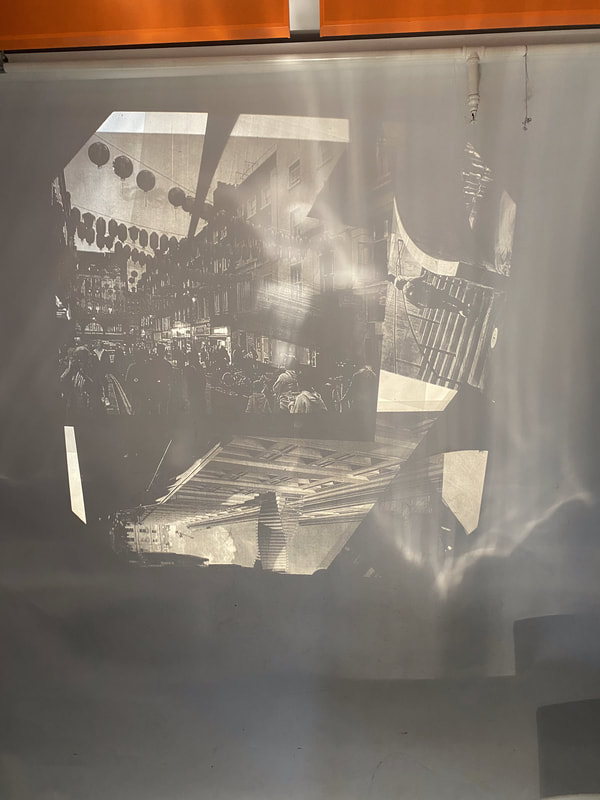
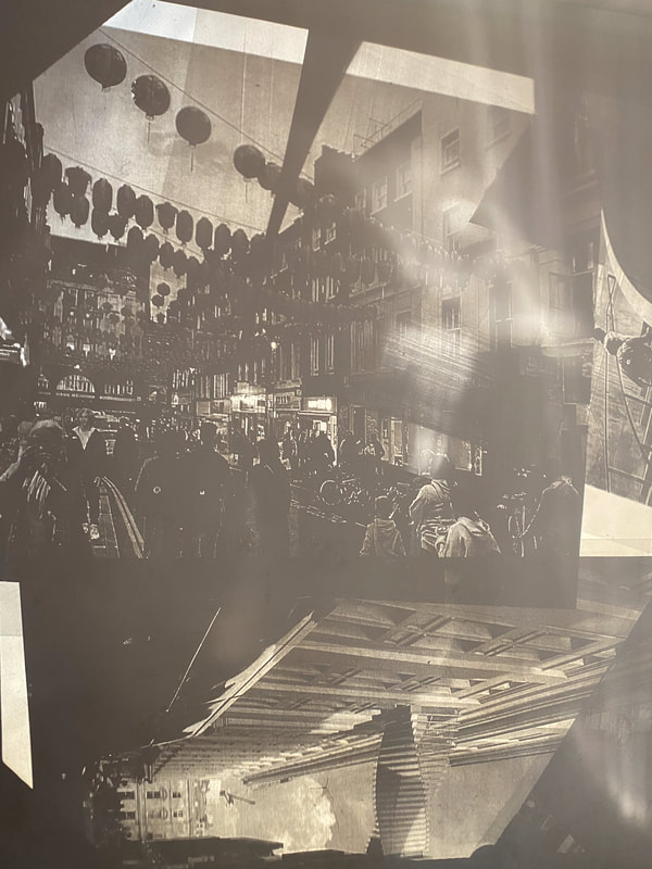
Outcome 5 - Projection
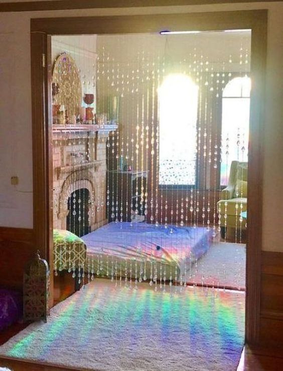
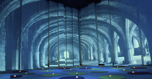
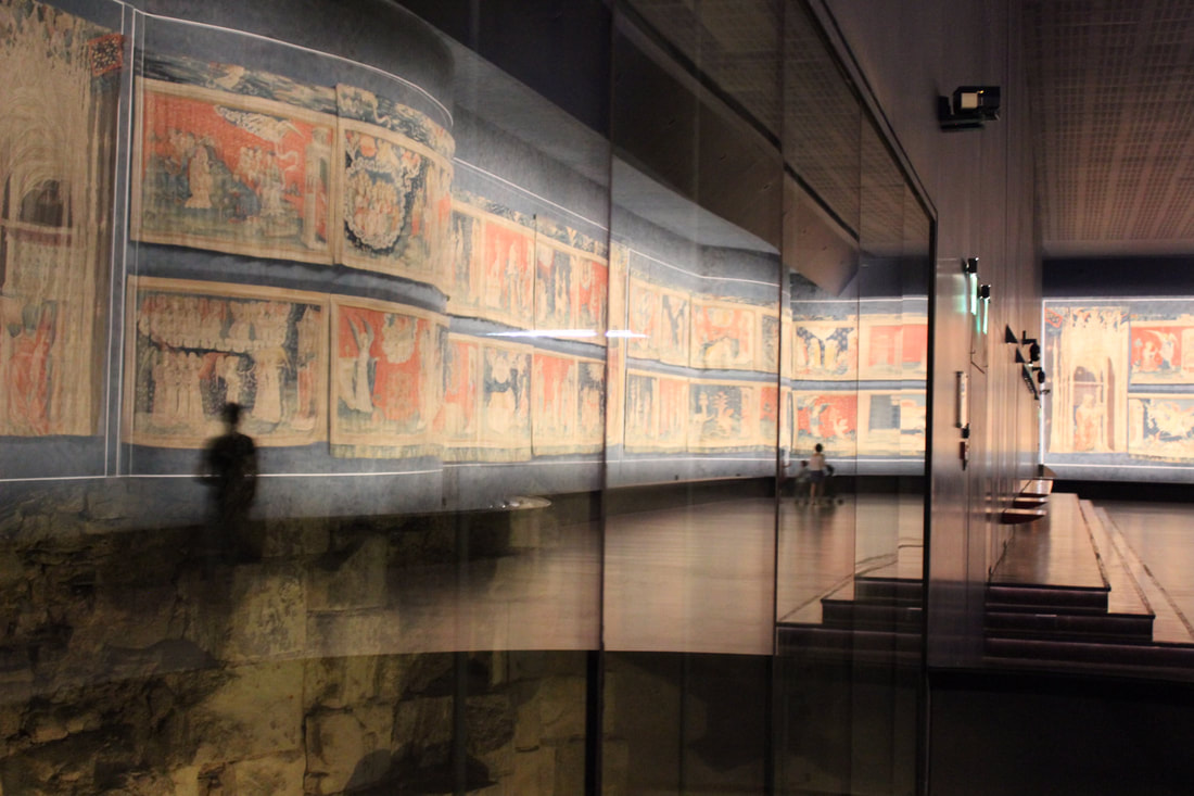
for my Sixth and final outcome I wanted to project my images onto a white wall , I was initially inspired by strings of beads hung in windows that reflect sunlight and thought it would be cool to try and recreate something similar . This then gave me the idea of projecting my images across a white room , I thought it would be interesting if I made a glass box of my acetates and inside had a light and then the shadows of the acetate images could be projected across a 360 view . I googled some similar examples of what I wanted to do and the some of the ones I found reminded me of old victorian baby lights that when you spun had characters or pictures casted across a surface , Below are the photos I used for inspiration . ( All credit to google )
|
|
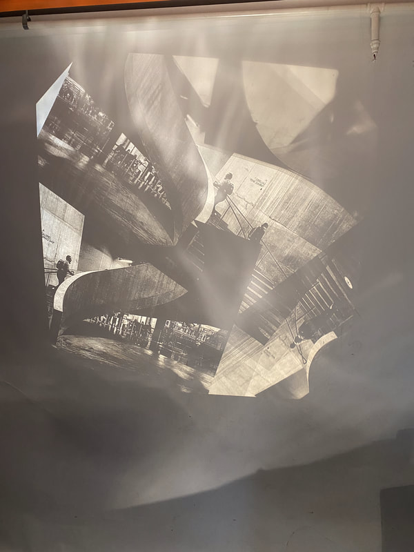
I Used an overhead projector to screen my images across a white surface , I had previously wanted to create some sort of glass sculpture using my acetates and a glass box but I made the decision not to as I felt the overhead projector would have a better effect and create the stony atmosphere I wanted to cast . I first experimented with all of my acetate images and layered them on top of each other to see the effect they would have .
|
|
Overall I was happy with how it turned out but I wanted there to less white space in-between the images and I wanted there to be a more consistent and cohesive feel to it . I then did another experiment with the projector using the same images repeated and shot from different angles . Below are the results . As I was creating this piece and I moved the acetates closer and closer to the camera I noticed that the distance of the image to the mirror in the projector affected the overall effect and I really liked how it looked .
|
|
It was difficult to photograph this as I needed to be able to hold the acetate image and take the digital photo but in the end I was happy how the photograph looked with the moving image obstructing view. below is a video documenting the process and experimenting with moving the image .
|
|
IMG_7715.MOV from Blanaid Luck on Vimeo. |
I Was really happy with how this turned out and felt that I had made really good improvement from my initial overhead experiment and am really happy with my final response to constructed landscapes
Evaluation
Constructed Landscapes was initially a project that I struggled with . At the beginning I found it difficult to come up with ideas that I wanted to pursue but through artist research and experimentation I found inspiration quickly . In previous projects I had created very practical responses in the way of physically making collages and producing images by re using others and that was something I really wanted to incorporate this into my work on constructed landscapes . I was really happy when I began experimenting with the acetates as I felt that I was meeting the targets I had set for my work and I'm really happy with the responses I've made . I think my favourite response was outcome three which I did in the dark room . It was really interesting to experiment with leaving each image in the developer for different times and seeing the effect it had on the clarity of the image and I just really liked the negatives I produced from that process . I also really enjoyed using the projector as it was something I had never done before and I think it was good too push my ideas and keep on building on what I've created .
